FULL SERVICE BEAUTY SALON & ACADEMY
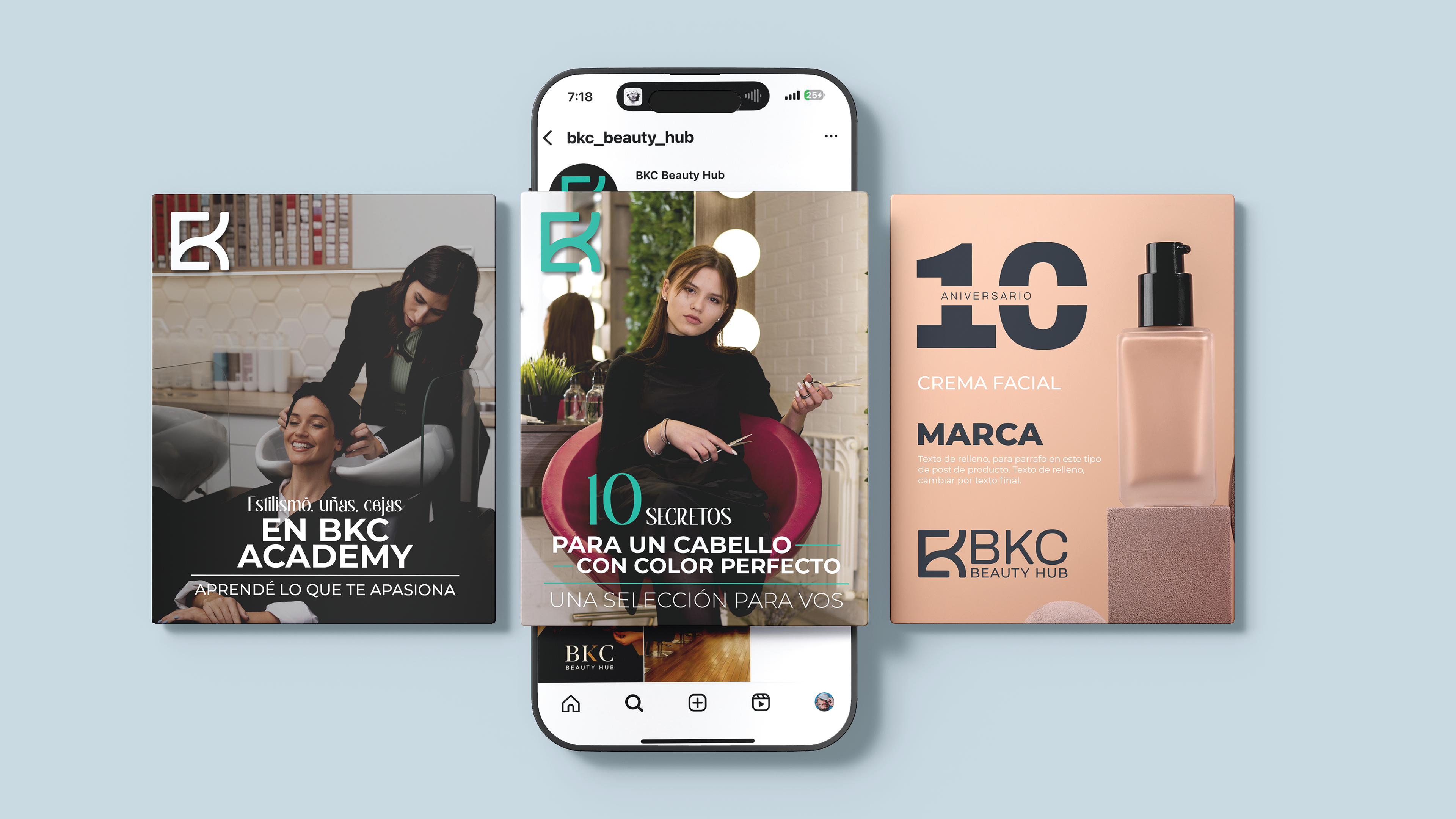
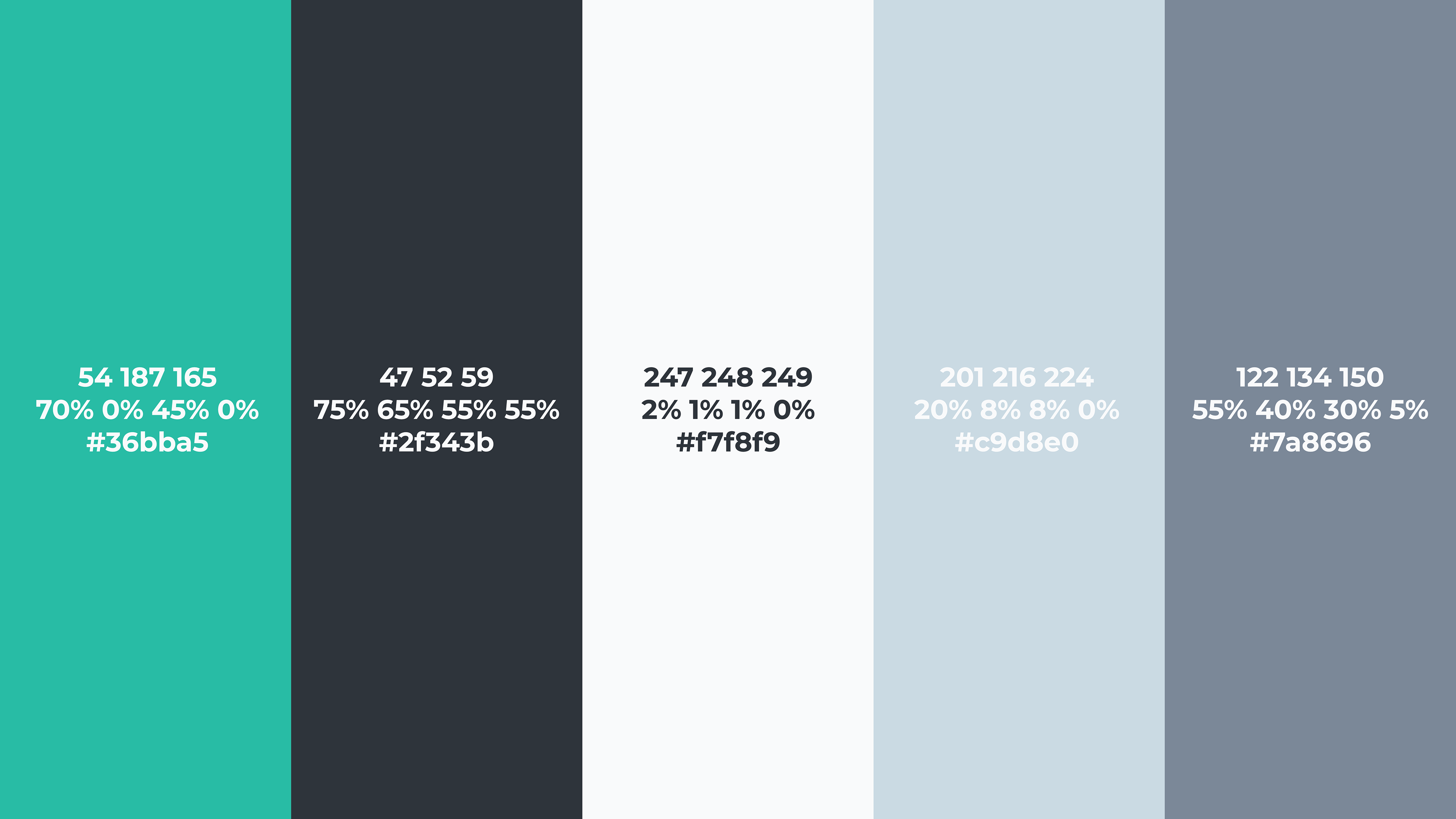
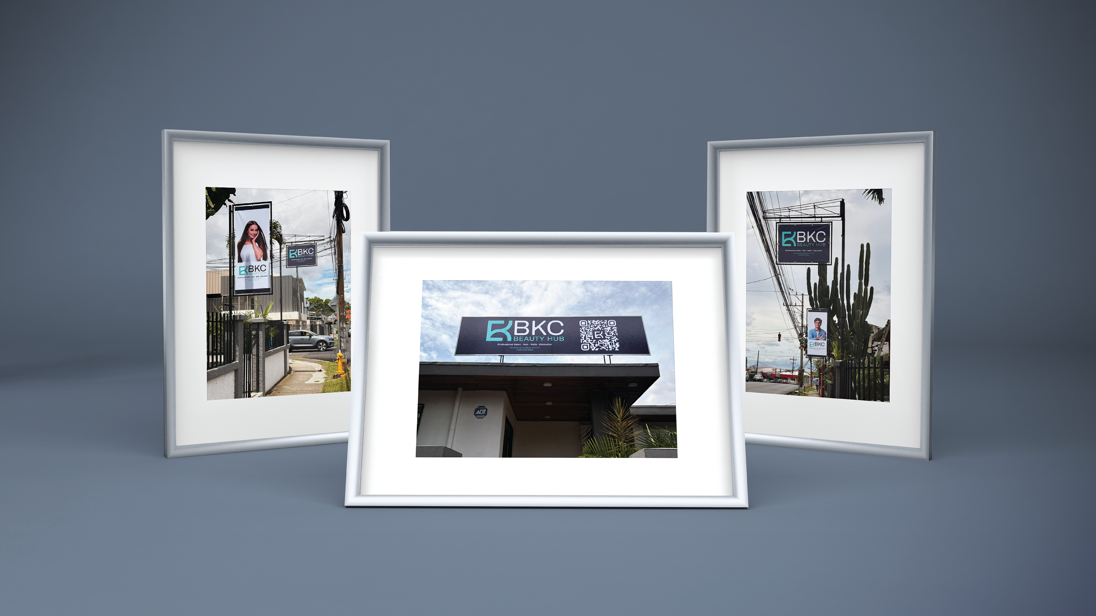
My recent branding project, BKC Beauty Hub, reflects a refined approach to modern beauty and holistic care. The visual identity centers around an abstract monogram that subtly fuses the letters BKC, forming a sleek and balanced symbol that evokes precision and elegance. Paired with a clean sans-serif wordmark—using fonts like SS Royal, Archivo, and Montserrat—the logo captures the brand’s dual essence as both beauty salon and educational hub. The color palette, blending soft neutrals with deep charcoal and a vibrant teal accent, conveys professionalism, serenity, and confidence. More than just a logo, BKC is a visual system designed to empower: minimal yet expressive, aspirational yet approachable—a true reflection of contemporary beauty culture.